February 9, 2003
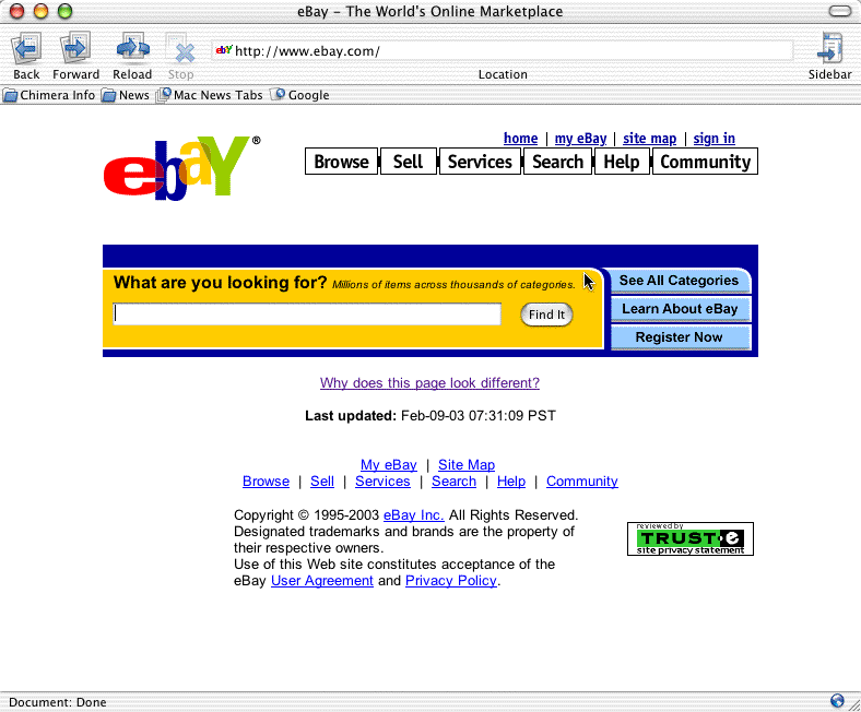
eBay goes Google
Over the past few months, I've noticed that eBay has been experimenting with different entry pages. This morning, I saw the most radical test yet -- a simple, Google-style front page that puts the focus directly on searching.
Obviously, one has to wonder why they're pursuing this thread. Do people perceive eBay as too complex? Do most visitors come to eBay to browse, or to locate something specific?
Currently eBay's existing home page is the only place visitors ever see items that isn't somehow included in their search results, and advertisers presumably pay pretty dearly for that placement. However, because the user hasn't yet indicated interest in anything, the display is completely untargeted, and most likely results in very low rates of clickthrough.
Over the past several years, eBay has moved far beyond its garage sale roots and become a destination for buying goods of all sorts, new and used. My guess is that eBay, as part of its continual hunt for alternative sources of revenue, is considering implementing a Google-style targeted advertising infrastructure based on search keywords. For advertisers, this has the obvious benefit of hawking their wares to visitors with a demonstrated interested in their goods; and for eBay, a very scalable and pervasive way to extract advertising revenue from all levels of eBay merchants, rather than just the rare few able to afford the splash screen.
Once this is in place, the home page -- busy, and irrelevant to most users -- can be reduced to its most important, primary task: search.
Posted by dreeves at February 9, 2003 11:51 AM